Location Quality
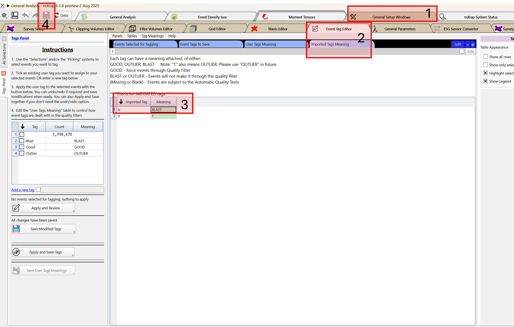
This window is used to investigate tagged blast locations from the events database and compare them with the blast locations set in the Blasts table to determine potential accuracy or offset issues with the system. In order to conduct this analysis, you first need to have tagged blasts. For IMS users, this information isn’t imported automatically. Please contact them to obtain the event tags database. For ESG users, the tags are imported automatically. You will however need to verify the meaning of these events to make sure they pass the quality filter.
To do so:
- Open the General Analysis app and go to the General Setup Window.
- Go to Event Tag Editor and then Imported Tag meaning.
- Edit the table and change the meaning for imported tag b to BLAST.
- Save the changes.
App workflow
Step 1 - Filtering the blasts
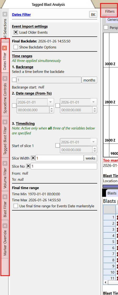
The first step is to filter down the blasts database to the time and area you wish to analyse. In the filter menu, there are options to filter dates, volume, blast, tagged blast and time group.
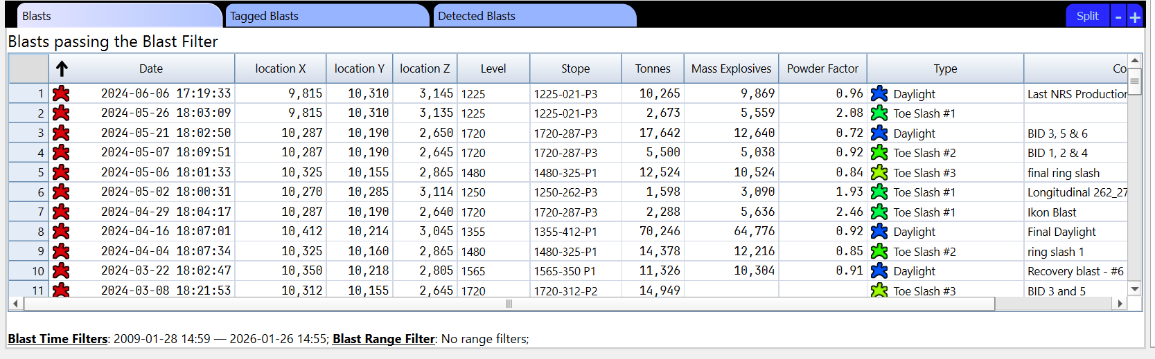
Step 2 - validate Blasts passing blast filters
Once the filters are applied, the blasts and tagged blasts passing the filters can be seen in their respective tables.
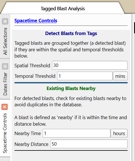
If there are duplicates in the blast database, or tagged blasts not being grouped properly, verify the Spacetime Controls panel.
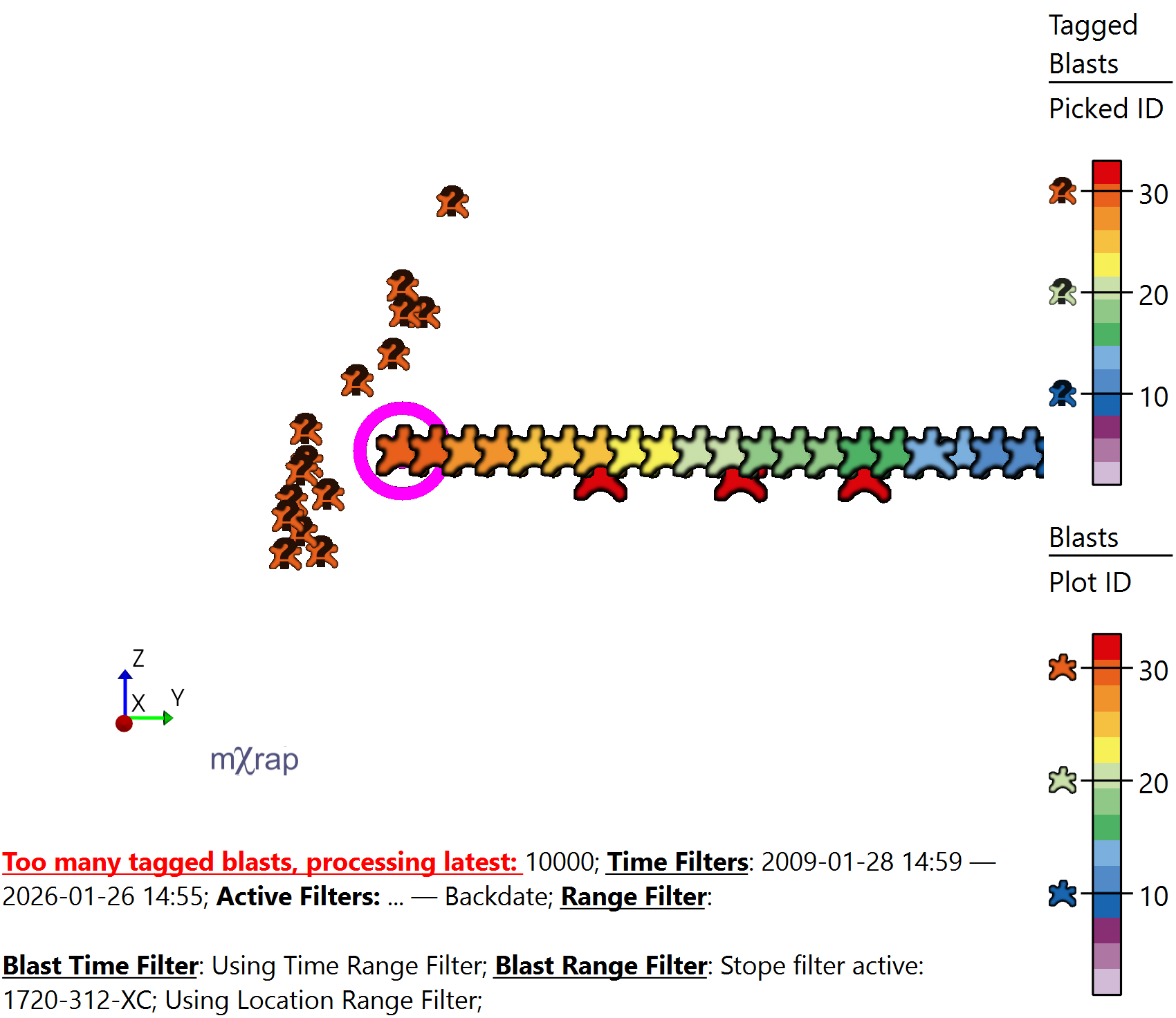
Step 3 - Visualise the filtered results in the 3D view
The results can be visualised in the 3D view, plotting the tagged blasts, blasts, sensors and surveys. The tagged blasts can be colored by distance to the blast (Distance 3D marker) to assess areas where the distance between the event and blast database increases.
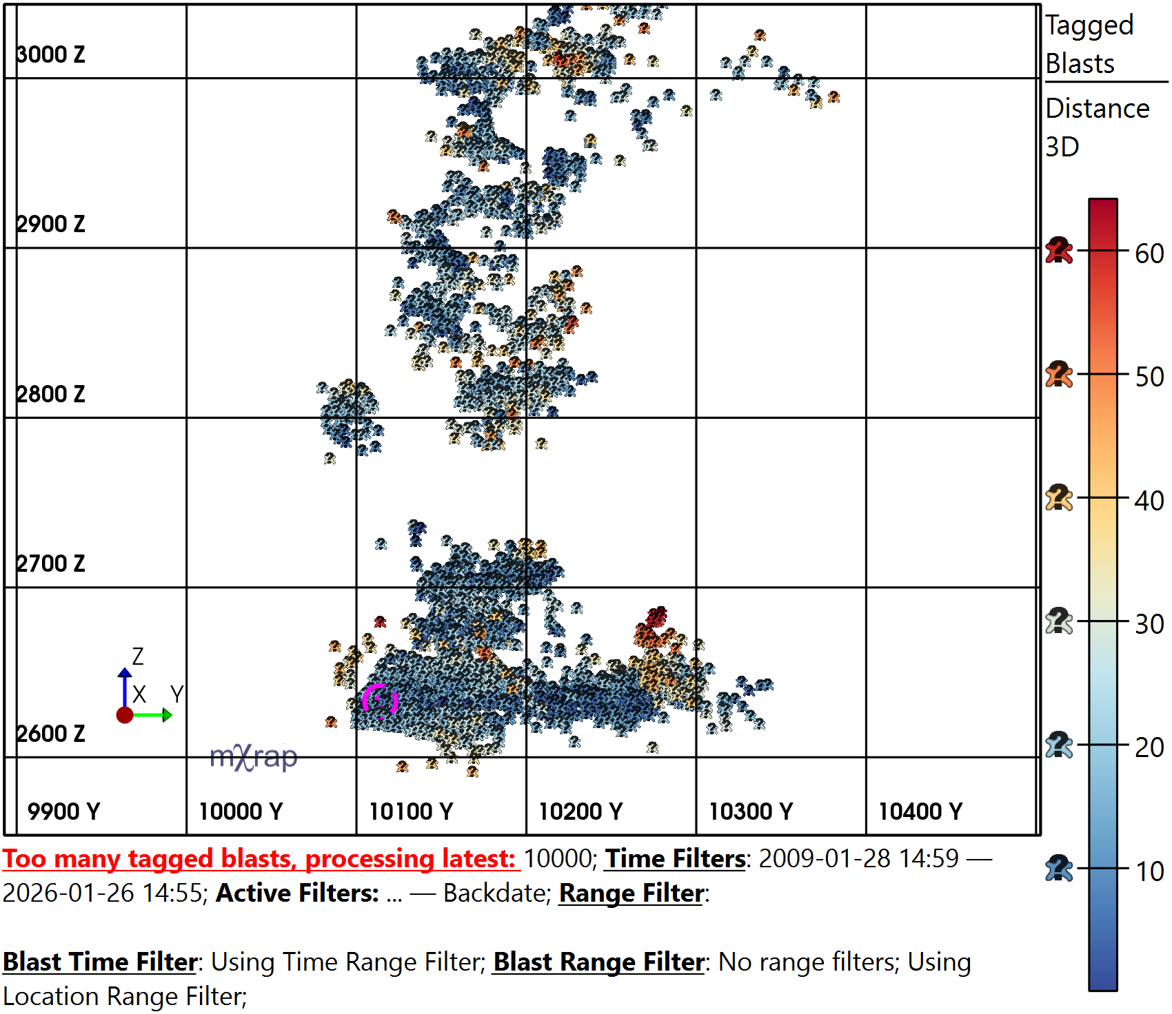
Specific blasts can be investigated by picking a blast (using F2) and using the Picked ID marker for the tagged blasts series which will filter down the tagged blasts to the ones associated with the picked blast.
Step 4 - Analyse Results using the charts
There are three charts that can be used to analyse the Location quality.
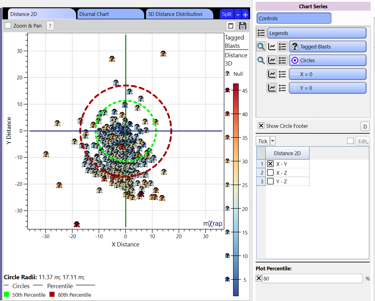
- Distance 2D
This chart plots the distance of the tagged blast to the blasts passing the filters based on the XYZ axis. The axis can be changed in the Controls panel allowing to look at the distances in different directions. Circles overlay the chart which represent distance for specified percentiles of the dataset. The green circle represents the 50th percentile and the red circle represents the percentile selected in the Controls panel. Their respective distances are listed in the footer of the chart.
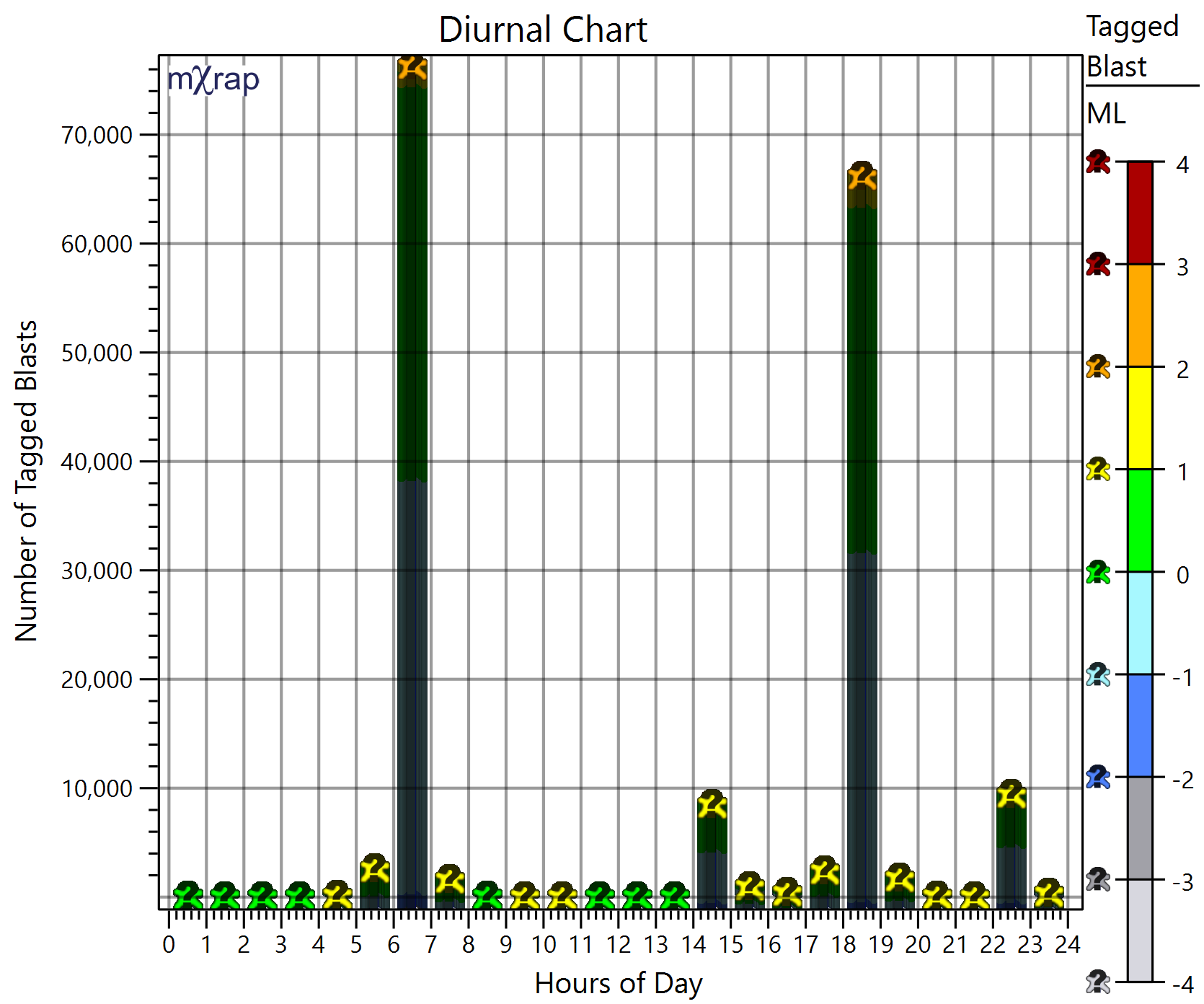
- Diurnal Chart
This chart plots the number of tagged blast events occurring at each hour in the day, allowing to identify potential outliers that have been tagged blasts, but occurred outside of the blasting time.
- 3D Distance distribution
This chart plots the cumulative distances between the tagged blasts and the blasts, grouped by tagged blast magnitude (rounded). The location quality based on the magnitude can be assessed.
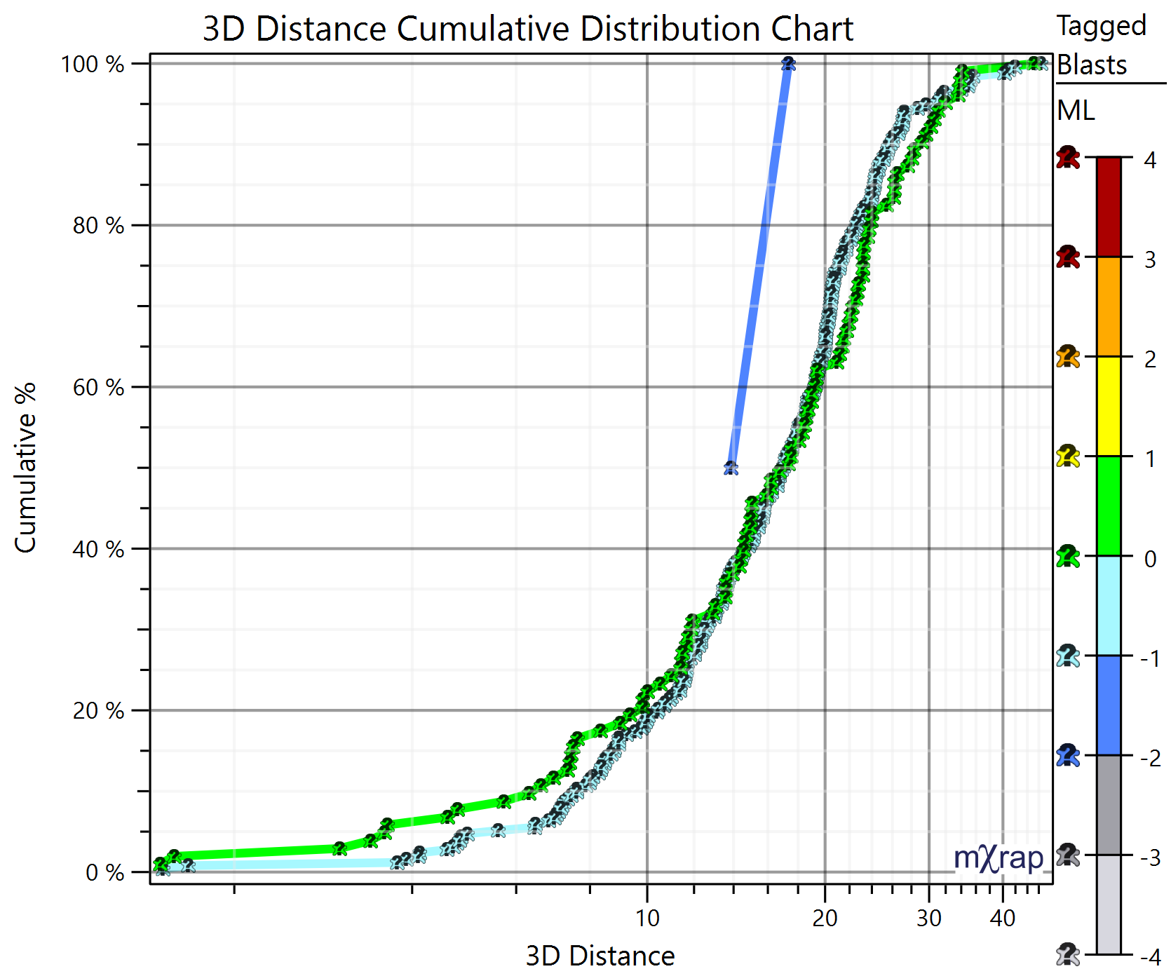
Picking a blast in the 3D view can be applied to these charts to visualise only the associated tagged blasts. Simply change the marker style to Picked ID.